
Performance Dashboard
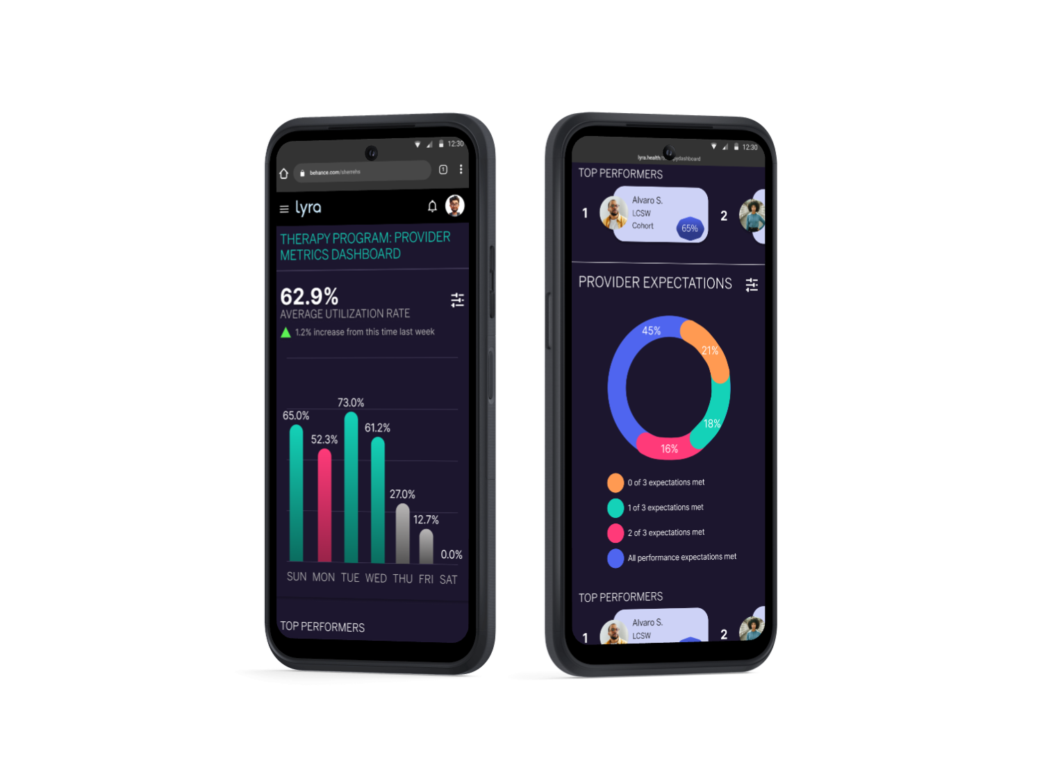
Redesigned performance management dashboard that is responsive from desktop to mobile
Project Type
UX/UI, Data Visualization, Research, Responsive Design
Length
2 months (January 2025)
Role/Teams
Designer (👋🏽), Data Science, Engineering, and Clinical Leadership
Company Background
Lyra Health is the leading provider of Workforce Mental Health benefits, available to more than 17 million people globally. Lyra is transforming access to life-changing mental health care using AI-powered provider matching, personalized support, and a digital platform to deliver evidence-based support for individuals and teams.
Summary
I designed a responsive version of an internal performance dashboard used daily by clinical manager to track clinician performance metrics. As a remote-first company, clinical managers and operations staff needed a responsive solution that is accessible quickly and across various devices.
Problem
As a remote-first company, internal users needed to access performance metrics data at a drop of a hat. This included being able to review data quickly on the go using their mobile or tablet devices when they were away from their computers. Non-responsive dashboards provided a sub-par experience resulting in delays once a user was able to access a laptop or desktop computer.
USER RESEARCH
KEY FINDING. Users were frustrated by the lack of responsiveness in the current dashboard.
Using known tickets, escalations, and conducting user interviews I found that:
Desire to access metrics on various devices. With the transition to remote work, users desired the flexibility to use various devices without sacrificing function.
Filters are a key feature. Alongside viewing the data, users needed the ability to use robust filtering and sorting to manipulate and view data in different ways.
UI desires. Given that the initial dashboard relied on Google Sheets and Tableau, users felt that the UI was lacking and desired a more pleasing aesthetic.
KEY INSIGHT. User flows validated the need for key features like filters to be accessible.

“The dashboard is so useful, but I can only really use it on desktop. I need to filter down several layers and doing that on mobile is simply unwieldy.” - Clinical Manager
“When do I not use this dashboard? I use it multiple times in a day and having it readily available allows me to do my job effectively.” - Sr. Clinical Manager
COMPETITIVE ANALYSIS



KEY FINDING. Balance between view ability and overload of data is key for the best user experience.
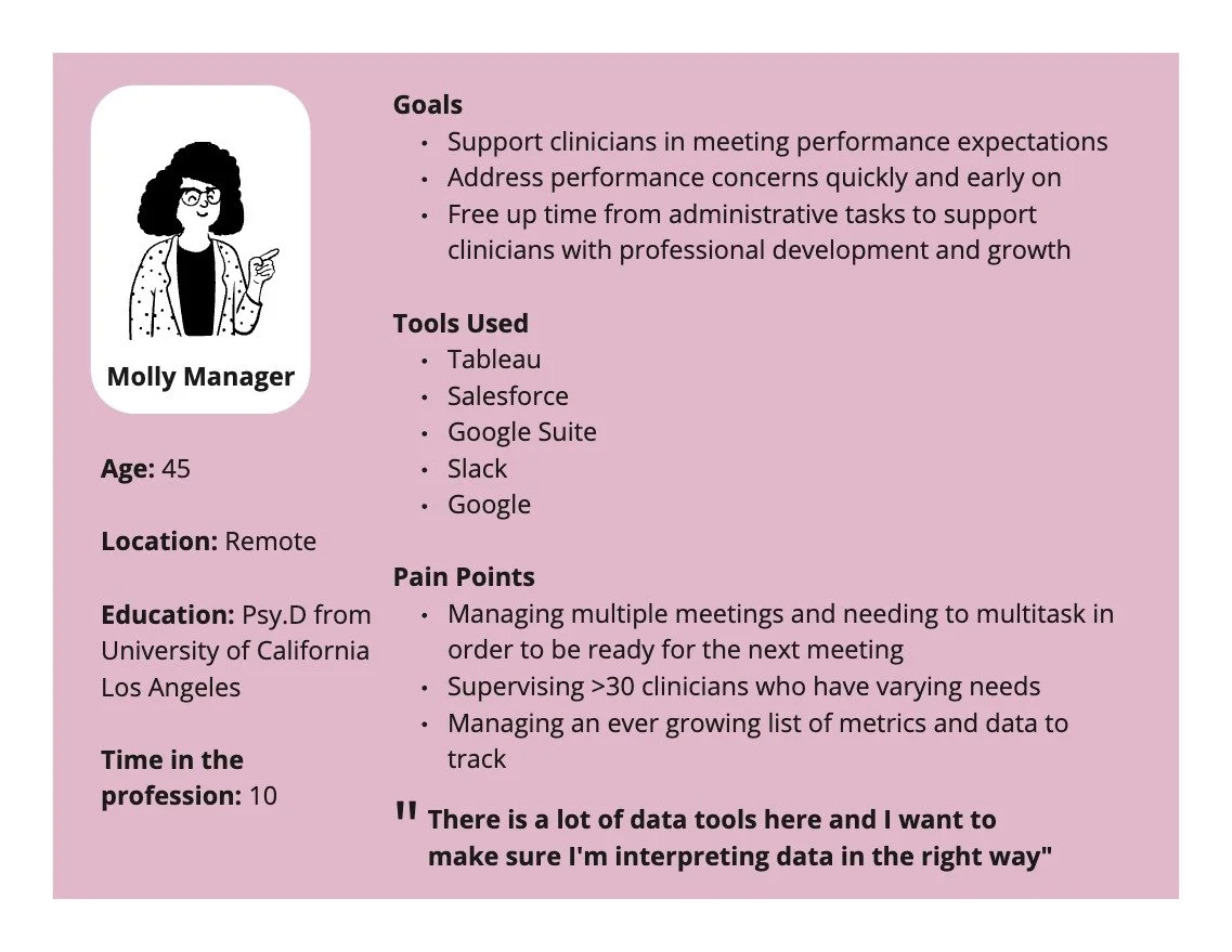
USER PERSONAS
KEY CONSIDERATION. Competing pressure from leadership included needing to think about scaling data insights which required additional training and buy-in from end-users (clinical managers).
DESIGN PROCESS
FEATURE SET PRIORITIZATION
-
Users want visualizations that are responsive and have similar features to Tableau and Google Sheets
Business Impact:
Clinical managers are able to track clinician productivity metrics in real-time
-
Key feature in order for data visualization and dashboard to meet MVP requirements
Business Impact:
Improve clinician efficiency
-
Available on desktop, but needed to address performance issues in a timely manner.
Business Impact:
Improve manager ability to address performance issues
-
Need to include responsive data visualization for quality assurance metrics.
Business Impact:
Improve clinical quality of care
-
Ongoing need to ensure new products are scalable and have the ability to integrate with other products
Business Impact:
Design for scale
Ensure data integrity and inter-operatibility
P0: Critical (must design/implement)
P1: High Priority,
P2: Deprioritized (nice to have)
WIREFRAMES & TESTING
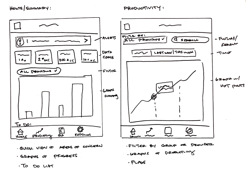
Low fidelity sketches
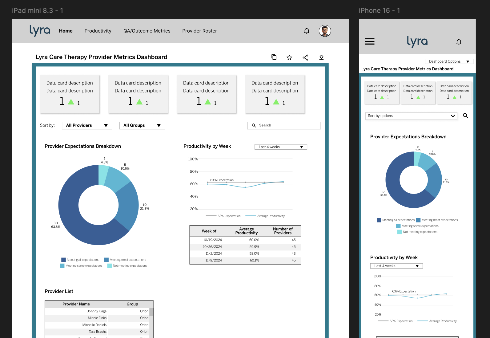
Mid fidelity wireframes
KEY DESIGN DECISION. Ongoing testing and QA was needed to ensure data flows remained unbroken across various data platforms including our data warehouses (SWaaS)
FINAL DESIGN DELIVERABLES
A fully responsive dashboard accessible via mobile, tablet, or desktop with little impact on functionality or usability (especially when reviewing data heavy visualizations).
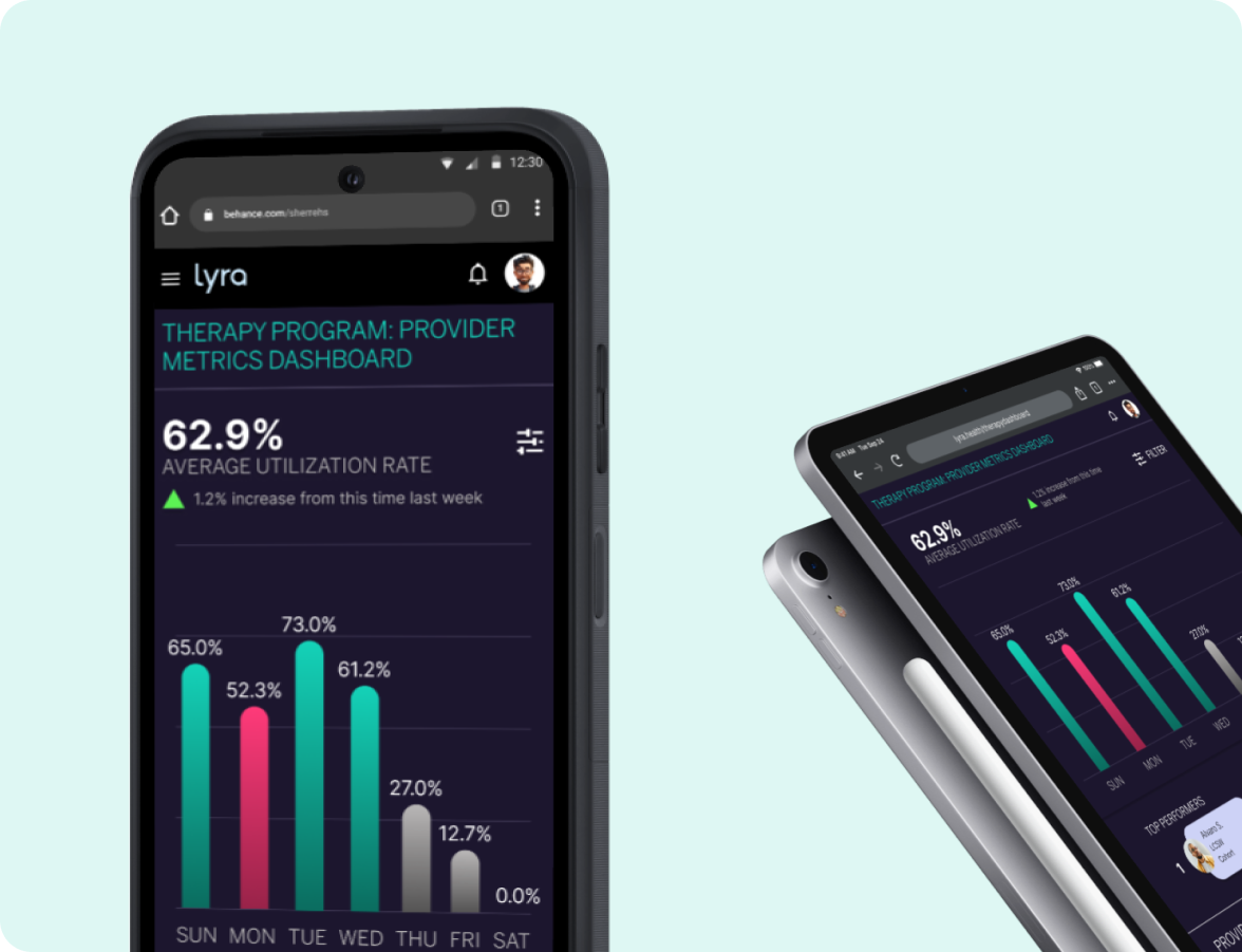
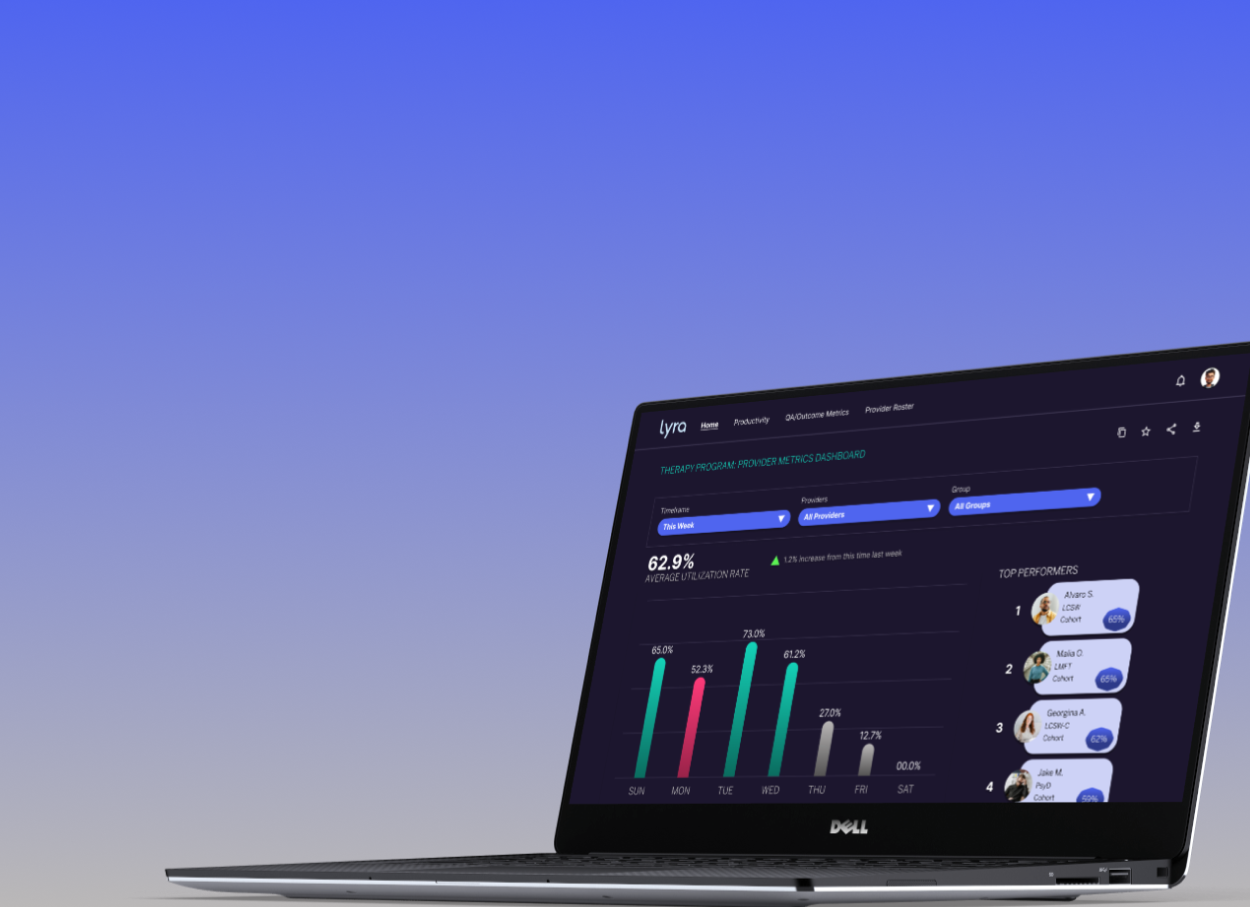
We were able to re-build a responsive web app that allowed users easier access to data while also supporting UI changes.
This project stretched my skills to design data visualizations (with the help and collaboration of data scientists) under the parameters of ensuring what is displayed is accurate and usable. Not only did this impact our user experience by increasing satisfaction it supported our business goals of a remote-first organization and adapting our tools towards remote work - ultimately helping our department meet our remote-first KPIs.
FINAL THOUGHTS
View more projects